The traders room — the client-facing portal where a forex trader manages their account, deposits, withdrawals, and trading platforms — is one of the most important pieces of software a brokerage operates. It’s the daily interface between the broker and the trader. It’s where the trader spends time when they’re not in the trading platform itself. And it’s where trust either gets built (transparency, speed, control) or destroyed (confusing UX, missing features, broken integrations).
Most brokerage operators inherit their traders room from a CRM vendor and accept whatever they’re given. That’s a mistake. A great traders room directly improves activation, retention, and lifetime value. A bad one quietly leaks all three.
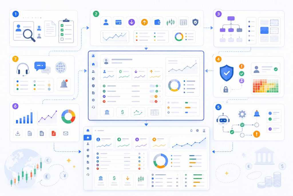
This guide breaks down what a modern forex CRM client portal needs to do, what features matter most for activation versus retention, how the back-office side should be wired, and what to look for when evaluating a vendor or designing your own.
Why the Traders Room Matters More Than Most Brokers Think
For most retail traders, the trading platform (MT4, MT5, cTrader, DXtrade) handles the trading itself. Everything else lives in the traders room — first-time onboarding, document submission, deposits, withdrawals, account management, IB or referral activity, support, and account settings.
That makes the traders room the broker’s primary opportunity to differentiate itself. Three traders comparing brokers won’t see much difference between two MT5 deployments. They will absolutely see a difference between a portal that lets them deposit in three clicks and one that makes them fill in a 12-field form every time. They’ll notice which broker shows them their open positions, total P&L, and IB commissions on one dashboard, and which one buries the information across five separate pages.
For an external view of what traders actually value in a broker — including the elements they evaluate in the portal — see what forex traders actually want from a broker and what CRM data shows.
The traders room also carries an outsized burden on first-time experience. A new client’s first impression of the brokerage operation is the registration form, KYC submission, and first deposit flow — all in the traders room. If any of those break, the client doesn’t try again. They register with a competitor.
The Core Dashboard: What Traders See on Login
The first thing a trader sees after login defines the relationship. A cluttered dashboard with twenty widgets and no clear hierarchy tells the trader the broker doesn’t know what’s important.
A clean dashboard with the three or four pieces of information that actually matter tells them the broker has done the work to understand its customer.
The essential dashboard elements:
- Trading account summary: Account number, currency, balance, equity, free margin, total P&L across all open positions, and a clear status indicator (active, restricted, demo, archived).
- Recent activity: Last few deposits, withdrawals, and trade results — with status indicators (pending, completed, rejected).
- KYC and document status: Visual indicator of where the client is in the verification process, with clear next-step CTAs if anything is incomplete.
- Quick actions: Deposit, withdraw, open new account, open MT4/MT5/cTrader trading terminal, contact support — all reachable in one click.
- Notifications: Promotions they qualify for, action items requiring attention, system messages — but ranked by relevance and not buried under marketing noise.
The dashboard should be the home base. Every other page in the portal should be reachable from it in one or two clicks, and the trader should be able to return to it from anywhere with a single click on a logo or home button.
A purpose-built traders room solution handles most of this structure out of the box. Bolt-on portals on top of generic platforms typically struggle with the integration depth needed to surface real-time balance and P&L data on the dashboard.
Client Onboarding Flow
The onboarding flow is the most important sequence in the entire portal. It’s where the highest drop-off happens and where conversion is most fragile.
The flow should be split into clearly visible steps:
- Registration: Email, password, country, language. Minimal fields. Social login (Google, Apple) as an option for traders who hate forms. Type-ahead phone number with country code. The fewer fields here, the better.
- Profile completion: Full name, date of birth, address, employment, source of funds. Can be deferred until after first deposit in jurisdictions that allow it, or required upfront for tighter regulators.
- Document upload: ID document (passport, ID card, driver’s license) and proof of address. Drag-and-drop upload, mobile camera capture, and clear validation feedback.
- Verification status: Real-time visibility into where each document stands — submitted, under review, approved, or needs resubmission with specific feedback.
- First account selection: Account type (standard, ECN, demo, swap-free), leverage, currency. Defaults that match the regulatory limits for the trader’s country.
- First deposit: Funded straight from the verification screen, or deferred for traders who want to explore demo first.
The status indicator throughout this flow should be honest and granular. “Your documents are under review and will be processed within 30 minutes during business hours” is much better than “Pending.” Honesty about timing builds trust; vague status messages don’t.
For brokerages designing the registration step, the types of registration forms used on forex brokerage websites covers the trade-offs between long-form and short-form approaches.
Deposits and Withdrawals
The deposit and withdrawal section is where the broker’s operational maturity becomes visible to the client. Friction here directly costs revenue.
Deposits
A modern deposit flow should:
- Display all available payment methods, sorted by speed and the client’s country.
- Show fees, minimum and maximum amounts, and expected processing time for each method.
- Confirm the deposit in real time when the PSP webhook arrives, with the trading account balance updating live.
- Show clear failure reasons if a deposit declines — “card declined by issuer” vs “exceeded daily limit” vs “geographic restriction” — with suggested next steps.
Withdrawals
Withdrawals are emotionally charged. Even when everything works, traders watch the request anxiously. The portal needs to make that experience as transparent as possible:
- Show estimated time to completion based on the method.
- Display withdrawal status in real-time stages: requested → under review → approved → sent → received.
- Notify the trader at every stage (in-app, email, optionally SMS).
- Show withdrawal history with clear records of every previous transaction.
| Feature | Deposit | Withdrawal |
|---|---|---|
| Speed expectation | Real-time credit | Hours to days |
| Approval flow | Auto on PSP confirmation | Often requires compliance review |
| Failure modes | Card decline, geo block, limit | KYC issue, document expiry, AML hold |
| Trader emotion | Excited (about to trade) | Anxious (waiting for own money) |
| UX priority | Speed and conversion | Transparency and updates |
The asymmetry is real and the portal needs to handle each differently. A great deposit page is fast and frictionless. A great withdrawal page is transparent and reassuring.
KYC Status and Compliance Visibility
The KYC section is often poorly designed in legacy CRMs — a single “status: pending” line with no context. Traders submit documents, wait, and have no idea what’s happening.
A well-designed KYC area shows:
- A clear progress indicator (e.g., “3 of 4 steps complete”).
- Each document submitted with its current status and reviewer feedback if rejected.
- Document expiry dates (and proactive warnings 60 days before).
- What additional documents may be needed for higher account tiers or larger deposits.
- A direct support contact for KYC-specific issues.
This isn’t just UX polish. It directly reduces support load — traders who can see their status don’t open tickets asking about it. It also catches problems earlier. A trader who can see “your address proof was rejected because the document is older than 3 months” can resubmit instantly. A trader who just sees “pending” calls support, then resubmits, then waits again.
Trading Account Management
Most retail brokers offer multiple account types — standard, ECN, swap-free, micro, demo, and increasingly copy-trading or social-trading accounts. A modern portal lets traders manage all of them from one place.
Essential management features:
- Multiple accounts on one login. A single client profile can have several trading accounts under it. The portal lets the trader switch between them without re-authenticating.
- Open new account in under a minute, with the right group, leverage, and currency selected for the client’s profile and regulatory jurisdiction.
- Internal transfers between trading accounts in the same currency, without going through deposit and withdrawal cycles.
- Leverage change requests with clear explanation of the impact and any regulatory limits.
- Account closure / archive with proper audit trail.
- Demo account creation that doesn’t require KYC — let prospects try the platform before committing.
For brokerages running PAMM or MAM strategies, the portal needs to expose the underlying account relationships clearly — which is the master, which are the followers, what the allocation rules are, and how to switch between them.
IB and Referral Area
Most retail brokerages have an Introducing Broker or affiliate program. Whether the same portal serves both end-traders and IBs, or whether IBs get their own partner portal, depends on the brokerage’s structure — but the trader-facing referral area is universal.
A trader-side referral area should show:
- Referral link (and/or QR code for mobile sharing).
- Number of referrals so far, broken down by status (registered, funded, active trader).
- Earned commissions or rebates accumulated.
- Withdrawal/Transfer status for any owed commissions.
- Marketing materials they can share (banners, landing pages, social-ready images).
For brokerages running deeper IB networks with multi-tier structures, the multi-level IB system handles the hierarchy, tier rules, and partner-portal side that goes beyond what end-traders see.
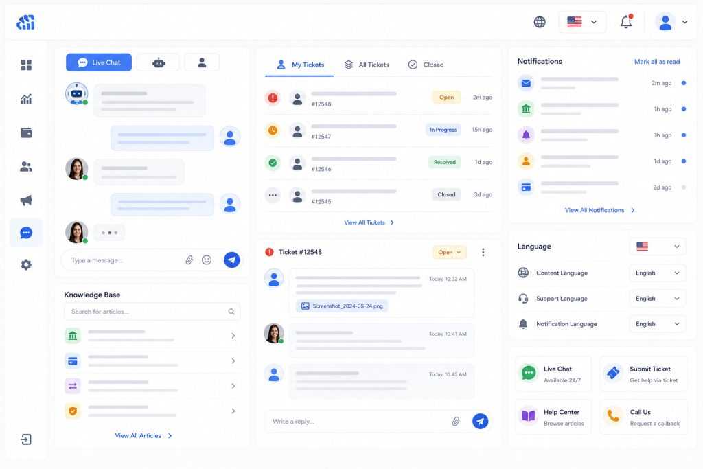
Support and Communication
The traders room is also the broker’s primary customer support surface for everything except inbound calls. Modern expectations:
- Live chat available from every page, with handoff between bot, junior agents, and senior agents based on the question type.
- Ticket system for issues that need investigation — clear history, status updates, file attachments.
- Self-service knowledge base linked from common pain points (how to deposit, why a withdrawal is delayed, how to open a new account).
- Notification center showing every system message, action item, and broker communication in one place — not scattered across email, SMS, and in-app pop-ups.
- Language switching that’s actually deep — not just the UI but also help content, support agents matched to language, and notifications delivered in the trader’s preferred language.
Support quality has an outsized effect on retention. A trader whose deposit issue gets resolved in 15 minutes through live chat becomes a long-term client. The same trader who waits two days for an email response goes to a competitor.
The Back-Office Side: How the Portal Integrates with the CRM
Everything visible to the trader in the portal has a back-office counterpart — the CRM that the brokerage staff uses to manage clients, approve KYC, process withdrawals, and run support.
The integration between portal and CRM needs to be tight and bidirectional.
| Portal action | Back-office consequence |
|---|---|
| Trader registers | New lead in CRM, assigned to the correct sales agent |
| Trader uploads KYC docs | Documents queue for compliance review with full audit log |
| Trader requests withdrawal | Workflow triggered with the assigned approver |
| Trader opens support ticket | Ticket queued by category and severity |
| Compliance approves account | Trader sees real-time status change, trading platform credentials issued |
| Support replies to ticket | Trader sees update in portal and gets notified |
| Withdrawal approved/declined | Trader sees status change and reason if declined |
The latency of these round-trips defines the trader experience. A portal that takes five minutes to reflect a back-office action feels broken. A portal that updates in real time as the broker’s team works feels responsive and modern.
For brokerages designing or evaluating this integration layer, the complete guide to forex CRM and trading platform integration provides the architectural context.
Mobile Considerations
Retail forex traders will access their portal on mobile. The portal needs to be at least mobile-responsive, and ideally available as a iOS and Android app.
What this means in practice:
- Document upload through phone camera, with on-device guidance (“hold steady, frame the document”).
- Push notifications for deposit confirmations, KYC status changes, support replies.
- Biometric login (Face ID, Touch ID) for fast re-authentication.
- Simplified mobile flows that hide secondary information rather than cramming everything onto a small screen.
A good test: can a new trader register, complete KYC, make a first deposit, and download the trading platform entirely from their phone in under 15 minutes? If the answer is no, the mobile experience needs work.
Common Pitfalls
The most consistent mistakes when designing or evaluating a traders room:
- Too many features, no hierarchy. Trying to show every possible piece of information on the dashboard. Pick the three to five things that matter on first login and hide the rest behind clear navigation.
- Misaligned status messages. Showing “pending” everywhere without explaining what pending means or when it’ll change. Be specific.
- Inconsistent terminology. Calling something “balance” on one screen and “equity” on another, when they mean different things. Pick the right terms and use them consistently.
- Underestimating support load. The portal’s UX directly drives ticket volume. Every confusing field, every unexplained status, every missing CTA generates support work.
- Treating the portal as static. The traders room needs ongoing iteration based on analytics and trader feedback. Brokerages that ship the portal and don’t touch it for two years fall behind.
- Skipping localization. A portal that’s English-only locks the broker out of every market where English isn’t dominant. Multi-language support is non-negotiable for international brokerages.
Conclusion
The traders room isn’t a UX nice-to-have. It’s the front line of the brokerage’s relationship with every client. The brokerages that treat it as a core asset — designing it, measuring it, iterating it — see the results in activation rates, deposit conversion, and lifetime value.
The brokerages that inherit a generic portal from their CRM vendor and never touch it are quietly losing clients to competitors who put the work in. The difference doesn’t show up dramatically on any one day. It shows up in retention curves six months later, in deposit conversion rates that quietly drift down, and in support tickets that never had to exist.
A well-designed traders room makes deposits feel effortless, withdrawals feel honest, support feel responsive, and the whole operation feel modern. Those signals compound. Brokerages that get this right tend to outgrow their peers within 18 to 24 months — not because of better marketing, but because every trader they acquire stays longer, deposits more, and refers more friends.

Request a Consultation on Implementing a Modern Traders Room
Get expert guidance on integrating your traders room with CRM workflows, payment systems, KYC processes, support tools, and trading platforms. We’ll help you design a synchronized environment where trader actions and back-office operations stay connected in real time.
Together, we’ll assess your current infrastructure and define a practical roadmap for building a scalable, user-friendly client portal.